
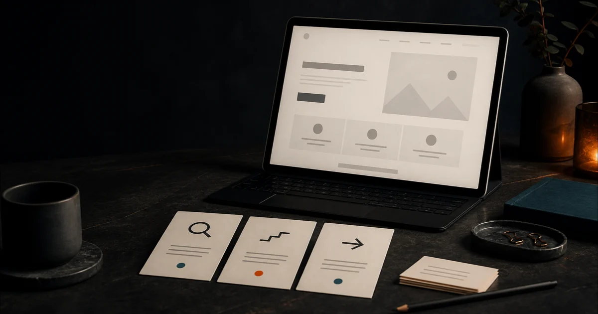
A homepage can look professional and still make a potential customer work too hard to understand the business. Before changing colors, layouts, or platforms, check whether the published page answers the buyer’s basic questions.
This checklist is designed for one decision: does the homepage communicate enough clearly enough to justify a larger redesign, or should the message be fixed first? It uses only evidence visible on the public page. It cannot establish what visitors think, where they abandon, or whether a change will increase revenue without analytics and real-user evidence.
1. Can a new visitor name the service?
Read the opening heading and supporting sentence without using the navigation or company history. Write down what the business appears to sell.
A strong opening usually names the service or outcome in ordinary customer language. A slogan such as “Quality you can trust” may support the message, but it rarely identifies the offer by itself.
Check:
- Is the primary service stated before the visitor must scroll?
- Does the language match what a buyer would search or ask for?
- Are important service categories grouped clearly instead of buried in one paragraph?
- Could the same heading belong to hundreds of unrelated businesses?
Record the exact words you observed. Do not rewrite yet.
2. Is the intended customer visible?
“We help businesses grow” leaves nearly every qualifying detail unresolved. A useful homepage indicates who the service is for through its heading, examples, service list, proof, or next step.
Look for evidence of the intended customer:
- homeowner, property manager, contractor, professional practice, or another defined buyer;
- project type or problem the business handles;
- geographic or operational limits;
- minimum scope, eligibility, or other facts that prevent a poor-fit inquiry.
Do not add exclusions simply to sound selective. State only boundaries the business actually follows.
3. Is the service area or delivery scope clear?
Local businesses often depend on geographic fit, yet the service area appears only in a footer address or contact page. Online businesses can have the opposite problem: the page implies universal availability without explaining delivery, jurisdiction, or support boundaries.
Verify that the homepage answers the relevant scope question:
- Which cities, counties, regions, or countries are served?
- Is the work on-site, remote, shipped, or digitally delivered?
- Are customer-location restrictions visible before checkout or inquiry?
- Does the wording reflect real operating capacity rather than an aspirational footprint?
Location clarity helps buyers self-qualify. It is not a ranking guarantee.
4. Is there one obvious next action?
The first viewport should help an interested visitor advance. Count the competing primary actions and write down what each one promises.
“Learn more,” “Get started,” and “Contact us” are visually familiar but often vague. Prefer an action that names the next step, such as requesting an estimate, checking availability, viewing the service process, or starting a defined audit.
Check:
- Is one action visually primary?
- Does its label describe what happens next?
- Does the destination work?
- Does a form ask only for information needed at that stage?
- Is the same action used consistently rather than renamed across the page?
A broken or misleading destination is a functional problem. Fix it before debating visual style.
5. Does proof support the specific promise?
Proof is strongest when it helps the visitor verify a claim. A row of generic icons, an unlabeled gallery, or an unsupported “best in town” statement may add decoration without reducing uncertainty.
Inventory the visible proof:
- named services and completed project types;
- factual experience or operating history;
- licenses or credentials that can be verified and are relevant;
- real process details;
- customer quotations used with permission;
- project images with truthful context;
- clear business identity and contact information.
Do not invent testimonials, customer counts, performance results, affiliations, or urgency. If the page cannot substantiate a claim, remove or qualify it.
6. Does the page explain the process?
Many buyers hesitate because they do not know what happens after clicking. A short process can reduce that uncertainty without turning the homepage into a manual.
Look for three practical stages:
- what the customer submits or chooses;
- what the business reviews or produces;
- what the customer receives or decides next.
Include timing only when the business can reliably meet it. State dependencies and limits where they materially affect delivery.
7. Are important claims separated from unknowns?
A public homepage can show what the business says and how the page is structured. It cannot prove conversion rate, search performance, legal compliance, customer interpretation, or revenue impact.
During review, label each note as one of four types:
- evidence: directly visible or reproducible;
- inference: a plausible interpretation of that evidence;
- unknown: requires analytics, interviews, account access, or specialist review;
- change: a bounded recommendation that follows from the evidence.
This prevents confident redesign recommendations from outrunning the available facts.
8. Prioritize before rewriting
Do not rewrite every section simultaneously. Group findings into a short decision order:
- broken paths and incorrect facts;
- unclear service, customer, or service area;
- ambiguous primary action;
- missing proof or process detail;
- secondary structure and presentation refinements;
- ideas that require measurement before changing.
For each proposed change, record the evidence, expected visitor benefit, effort, and acceptance check. “Improve the hero” is not testable. “The opening heading names the primary service and service area, and the primary action opens the approved estimate form” is.
9. Establish a measurement baseline
Before publishing multiple changes, record the metrics the business already has permission and tooling to use. Useful baselines may include the primary call-to-action click, completed inquiry, qualified lead, scheduled appointment, or checkout completion.
Exclude staff, developer, and synthetic testing where possible. Do not interpret impressions or page views as sales. Change one meaningful variable at a time when the traffic volume supports comparison.
Turn the checklist into a decision
If the review finds incorrect information, broken destinations, or an unclear offer, fix those issues first. If the message is sound but the page remains difficult to navigate, slow, inaccessible, or inconsistent, a broader redesign may be justified. The checklist does not replace accessibility, legal, security, performance, or search-specialist review.
Fireproof Studio’s Clarity Agent applies an automated evidence → priority → change structure to one public homepage and delivers a private report after payment. It is a $29 one-time audit for U.S. customers. The automated report supports human judgment; it does not guarantee traffic, rankings, compliance, or sales.
Whether you use the checklist manually or start an audit, the decision standard is the same: can a new visitor identify what the business does, who it serves, why the claim is credible, and what happens next?