
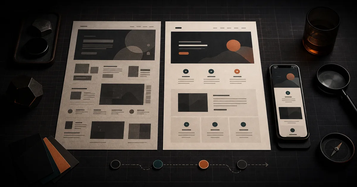
A website redesign proposal can sound convincing while leaving the most important question unanswered: what are you actually buying?
Words such as modern, clean, and high-converting describe an intention. They do not show you where a customer will click, whether your services make sense, or what the site feels like on a phone. You only learn that when there is something concrete to inspect.
That is why a redesign preview matters. It turns a promise into an object you can question.
The goal is not to find a design that simply looks different. It is to find a direction that fits your business well enough to justify the work that comes next.
A screenshot is not the whole answer
A polished homepage image can show colors, type, spacing, and general style. That is useful, but it is a narrow slice of a website.
A buyer still needs to know what happens beyond the top of that page:
- Can you move through the navigation without guessing?
- Is the most important service easy to find?
- Do buttons lead somewhere sensible?
- Does the page still work at a narrow phone width?
- Are forms, menus, galleries, and other key pieces represented honestly?
- Does the rest of the site follow the same direction?
The closer a preview is to the thing that will be delivered, the more useful your review becomes. A clickable version lets you judge sequence and behavior, not just appearance. It also exposes missing pages and awkward transitions that a single image can hide.
Ask what is real in the preview and what is still a placeholder. The answer tells you how much evidence you actually have.
Start with the job, not the style
It is easy to review a redesign by asking, “Do I like it?” That question matters, but it is too broad to guide a purchase.
Start with the job your website needs to do.
A roofer may need a homeowner to understand the service area and request an estimate. A restaurant may need someone to check the menu, hours, and location. A consultant may need a visitor to understand a specific problem before booking a call.
Write the primary job in one sentence:
This website should help this visitor understand this offer and take this next step.
Then use that sentence as the standard for the preview. If the redesign makes the job clearer, it is moving in the right direction. If the new visuals compete with the job, the design still needs work.
This keeps the review grounded. You are not choosing between vague tastes. You are checking whether the design supports a real decision.
Review the preview in five passes
Trying to judge everything at once usually produces feedback such as “make it pop” or “I am not sure about the blue.” A short, repeatable review gives you better information.
1. The first-glance pass
Open the homepage and give yourself a few seconds before scrolling.
Can you tell what the business does, who it serves, and what you should do next? You should not need insider knowledge to decode the headline or the main button.
Do not fill in gaps from memory. Read it as if you found the business for the first time.
2. The task pass
Choose the most important visitor task and try to complete it.
Find a service. Locate the menu. Request an estimate. Book an appointment. Check the store hours. Whatever matters most, follow the path from entry to action.
Notice every moment where you hesitate. A label may be unclear. A button may arrive too early. Important proof may appear after the decision point instead of before it. Those moments are more useful than a general opinion about the design.
3. The truth pass
A redesign can be attractive and still misrepresent the business.
Check names, services, locations, hours, contact details, policies, and claims. Look for missing qualifiers and invented certainty. Make sure sample content is clearly sample content.
The design should improve how the truth is presented, not rewrite the truth without your approval.
4. The phone pass
Open the preview on a phone, or narrow the browser until it resembles one.
Check the navigation, text size, buttons, forms, image crops, and the order of each section. Confirm that the primary action remains easy to reach and that nothing important disappears.
Do the task again. A layout that looks orderly on a large screen can feel completely different when every section is stacked.
5. The edge-case pass
Try the less flattering content.
Use a long service name. Open a page with little text. Look at a page with many items. Test a form error. Follow an empty or unfinished path if one is available.
Perfect sample content can make a fragile design look complete. Edge cases show whether the direction can handle the business you actually have.
Separate corrections from preferences
Good feedback becomes easier when you label it.
Corrections are facts or functional problems: a wrong phone number, a missing service, an unreadable button, a broken link, or a form that does not submit.
Clarity changes help the visitor understand or act: a more direct headline, a better section order, a visible service area, or a clearer next step.
Preferences are choices such as a warmer color, a different image treatment, or a less formal typeface.
Handle them in that order. A redesign with the right shade of green is still the wrong redesign if customers cannot find the contact path.
This structure also makes revision conversations more productive. “I do not like it” gives the designer very little to work with. “The estimate button disappears on mobile, and the service area appears after the form” identifies a problem that can be tested again.
Know what the preview cannot prove
A useful preview reduces uncertainty. It does not eliminate it.
It cannot guarantee more leads, higher sales, better search visibility, long-term reliability, or good support. It may not fully exercise third-party tools, analytics, payments, booking systems, or the eventual hosting setup. A visual review also is not a substitute for accessibility, security, performance, or compliance testing.
Ask what will be tested before launch, who is responsible for each check, and which parts of the preview are not yet production-ready. If the answer is vague, keep that uncertainty in your decision.
The honest standard is simple: judge the preview for what it demonstrates, and do not treat it as evidence for what it does not.
Questions to answer before you commit
By the end of the review, you should be able to answer these questions in plain language:
- What parts of this preview will carry into the finished site?
- Which content came from my current site, and which content was created for the redesign?
- What is missing, incomplete, or represented by a placeholder?
- How will the design handle phones and less-than-perfect content?
- Which business task does the new structure make easier?
- What still needs to be tested before the site goes live?
- How are corrections and revision decisions handled?
- What will I control after the work is delivered?
You do not need every implementation detail before buying. You do need a clear boundary between what you have seen, what has been promised, and what remains undecided.
Buy evidence, not adjectives
A redesign preview gives you a better conversation.
Instead of debating whether an idea will feel right, you can follow the navigation. Instead of trusting a promise about clarity, you can try to find the service. Instead of discovering content problems after the commitment, you can identify them while the direction is still easy to question.
That does not make the decision automatic. It makes the decision informed.
Want a concrete redesign to evaluate instead of another abstract promise? SiteGlowUp is a Fireproof Studio product that currently lets you review a live website preview before deciding whether to keep it. You can also read how we combine automation with human judgment across our work.