
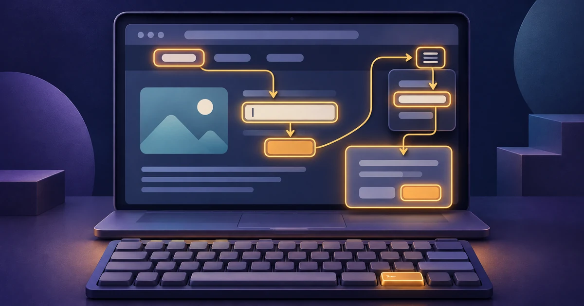
A website can look finished while one of its most important tasks stops at the first menu, form field, or dialog a visitor cannot operate with a keyboard.
You do not need to start with every page. Choose one real visitor task, put the pointer aside, and follow that path from the page beginning to a useful result. Record where focus moves, what the focused control looks like, which keys work, what opens, what closes, and whether a person can recover from an error.
That creates evidence a website owner or developer can reproduce. It does not certify that the page or site conforms to an accessibility standard. W3C describes its Easy Checks as a first review that covers only a few accessibility issues; a page can appear to pass those checks and still have significant barriers. Treat the keyboard-only check below as a practical starting point, not an accessibility audit, legal opinion, or compliance guarantee.
Choose one visitor task before pressing Tab
Write the task as an outcome, not a page name.
Useful examples include:
- find a service and send an inquiry;
- choose a product option and reach the next purchase step;
- open the main navigation and reach a specific page;
- locate a support answer and follow its contact link;
- correct a required field and submit a form.
Keep the first path narrow enough to repeat exactly. If you start with “check the whole site,” different reviewers can wander through different controls and produce results that are difficult to compare.
Record the test context before the first keystroke:
- page URL and task;
- browser and browser version;
- operating system;
- viewport or window size;
- zoom level and relevant browser or operating-system settings;
- signed-in or signed-out state, when relevant;
- starting state, including an open banner, empty form, saved cart, or other condition that changes the path;
- date and the site version or release identifier, if one exists.
These details matter because browser and operating-system conventions are not identical, and a component can behave differently after a responsive layout change. Record what you observed in the tested context instead of turning one result into a claim about every device and configuration.
Start clean and put the pointer aside
Reload the page, place the pointer somewhere neutral, and do not use it to recover when the path becomes inconvenient. Start from the page beginning.
Use Tab to move forward through focusable controls and Shift + Tab to move backward. On each stop, say the control name and purpose aloud or write it down. That small step makes unexplained jumps easier to notice.
W3C’s Understanding Keyboard explains the goal that functionality should be operable through a keyboard interface, apart from functions whose underlying operation depends on the path of movement. The page also notes that platform and user-agent conventions matter. For this review, the practical question is: can the person complete the selected task without substituting a pointer for an action the page should make available from the keyboard?
Stop and record the first control that blocks the task. Do not skip it and call the path successful because a later link happens to reach the same page.
Trace focus forward and backward
Focus order does not need to follow every visual coordinate. It does need to preserve meaning and operation.
W3C’s Understanding Focus Order says that when sequential navigation affects meaning or operation, focusable components should receive focus in an order that preserves both. The guidance also explains that more than one logical order can work.
During the forward pass, look for:
- focus moving into navigation before the current page’s main task;
- a control receiving focus before the instruction or label needed to use it;
- focus jumping to an off-screen, collapsed, or visually unrelated area;
- a visible control that never receives focus;
- a decorative or inactive element adding a confusing stop;
- focus moving behind an open menu or dialog;
- an unexpected page change or action triggered merely by moving focus.
Then reverse through the same section with Shift + Tab. A forward path can look reasonable while the reverse path returns to an unrelated control or loses the place where an overlay was opened.
Record the entry control and exit control around every menu, dialog, form section, or custom widget. “The dialog worked” is weaker evidence than “focus moved from the Contact button to the dialog heading, stayed within the open dialog, and returned to Contact when the dialog closed.”
Keep the focused control visible
A keyboard user needs to know where the next keystroke will act.
W3C’s Understanding Focus Visible explains that a keyboard-operable interface needs a mode in which the focus indicator is visible. Its purpose is to help a person identify the current point of keyboard interaction.
At every stop, check whether you can identify the focused control without guessing. Look at the indicator against the control itself, nearby colors, images, gradients, and changing states. Do not accept a brief flash that disappears while focus remains on the control.
Also check whether author-created content hides the focused item. W3C’s Understanding Focus Not Obscured (Minimum) discusses focused components being hidden by content such as sticky headers, sticky footers, banners, and non-modal dialogs. In the tested viewport, note whether the component is fully visible, partly covered, or entirely hidden.
The worksheet should separate two observations:
- Could you locate the focus indicator?
- Was the focused component obscured by other page content?
Those questions can have different answers. A bright outline does not help if the focused control is completely behind a banner.
Operate the control, not only its focus stop
Reaching a control is not the same as using it.
Try the key expected for the control and tested platform. Native links and buttons commonly respond to established browser behavior. Text inputs need typing, selection, and editing. Checkboxes, select controls, disclosure buttons, menus, tabs, listboxes, sliders, grids, and other widgets can have different expected keys.
Do not invent one universal key list. First identify what the component is intended to be, then compare the observed behavior with the documented pattern for that component. W3C’s ARIA Authoring Practices Guide keyboard interface guidance distinguishes keyboard navigation between components from navigation inside composite widgets. It also explains that browsers do not automatically provide keyboard behavior for custom graphical components merely because ARIA roles, states, or properties were added; authors must implement the interaction.
For each relevant control, record:
- the keys tried;
- the expected action for that control and context;
- the action that actually occurred;
- any state change that was visible;
- the next focus location;
- whether the selected visitor task could continue.
Avoid diagnosing the code from the outside. “Menu button does not open with the expected activation keys in this browser” is an observation. “The JavaScript click handler is wrong” is a suspected cause until the implementation is inspected.
Open, use, and exit menus, dialogs, and overlays
An overlay changes more than what is visible. It can change which controls should receive focus, which content is available, how the component is exited, and where the person continues afterward.
For each menu, dialog, cookie banner, drawer, popover, or other layer on the task path, check:
- Can the opener be reached and activated with the keyboard?
- When the layer opens, where does focus move?
- Can every required action inside it be reached and operated?
- Can the person exit using a documented or conventional keyboard method?
- After closing, does focus return to a sensible place?
- Does keyboard focus stay out of page content that should be unavailable while a modal dialog is open?
W3C’s Understanding No Keyboard Trap explains that when focus can move into a component, it must also be possible to move away using a keyboard interface. If leaving requires something beyond standard exit methods, the user needs to be told how.
Do not mark every temporary focus cycle as a trap. A modal dialog can intentionally keep focus within the dialog while it is open if the person can dismiss it using the keyboard and continue. Record the exact entry, exit, instruction, and return behavior so a reviewer can distinguish a managed modal interaction from a dead end.
Trigger a form error and recover without the pointer
A clean form path can hide the most important failure. Trigger one safe validation error, such as leaving a test field empty, and try to recover.
Check whether:
- the submission action works from the keyboard;
- the page explains what needs attention;
- focus moves predictably or the person can find the error in a logical sequence;
- the field, instruction, and error remain connected in a way the tested experience exposes;
- correcting the field does not require a pointer;
- submitting again reaches the expected result without duplicating an action.
Use non-sensitive test data. Do not send a real purchase, support request, or other consequential transaction merely to complete a review unless that exact action and test environment are authorized.
If the task includes a customer inquiry, compare the observed path with the service website inquiry checklist. That article covers the context and next steps an inquiry path should make clear. The keyboard check adds a different question: can a person actually reach, complete, correct, and submit that path with the tested keyboard interface?
Copy this keyboard-only review worksheet
The example below is fictional. Northstar Garden Care is an imaginary service business, and /estimate/ is an invented route. The observations are examples of useful evidence, not customer results or claims about a real website.
On a phone or other narrow screen, swipe the table horizontally to read every column.
| Route and task | Test context and starting state | Control or step | Keys tried | Expected behavior | Observed behavior | Entry focus | Exit focus | Evidence | Result | Owner | Retest |
|---|---|---|---|---|---|---|---|---|---|---|---|
/estimate/ — request a garden estimate |
Fictional site; desktop browser; signed out; 100% zoom; empty form; banner closed | Main navigation menu button | Tab, then Enter and Space in separate reloads |
Focus is visible; activation opens the menu; the menu items are reachable; closing returns focus to the opener | Focus ring was visible. Both activation checks opened the menu. Escape closed it and returned focus to the menu button |
Browser chrome, then skip link, logo link, menu button | Menu button after close | Short screen recording plus key log | Pass in this context | Frontend owner | Repeat after any navigation change |
/estimate/ — request a garden estimate |
Same context | Service type custom listbox | Tab, Space, arrow keys, Enter, Escape |
The control can be opened, an option can be selected using the documented widget keys, and the task can continue | Focus reached the control, but none of the tested keys opened it. Pointer interaction was not substituted | Previous text field | Remained on listbox; task blocked | Recording, browser/version, visible label, keys tried | Blocked | Component owner | Required after fix; repeat exact keys and continue the form |
/estimate/ — request a garden estimate |
Same context after the fictional listbox is corrected | Required email field and Submit button | Tab, type invalid test value, Tab, Enter, then Shift + Tab |
Submission exposes the error; the error can be found and corrected; focus order remains understandable | Error appeared beside Email, but focus moved to the page beginning. Reverse navigation required many stops before returning to the field | Submit button | Page beginning after validation | Recording and focus sequence | Needs review | Form owner | Define intended error focus, correct, then repeat invalid and valid paths |
/estimate/ — request a garden estimate |
Narrow viewport; fictional correction present; sticky help bar visible | Final consent checkbox and Submit button | Tab, Space, Tab |
Focused controls remain visible above the sticky bar; checkbox changes state; submit remains reachable | Checkbox could be operated, but the sticky help bar entirely covered Submit when it received focus | Consent checkbox | Submit button behind bar | Narrow-viewport screenshot and window size | Blocked | Layout owner | Repeat at recorded viewport and one adjacent width |
Copy the headings into the team’s issue tracker, spreadsheet, or test record. Add a row for each control that affects the selected task. Keep pass results as well as failures; they show what was actually exercised and help protect adjacent behavior during a correction.
Fix the earliest break and repeat the same path
When a task fails in several places, fix or route the earliest blocking break first. A later result can be misleading if the reviewer reached it only by using the pointer or manually changing the page state.
Retest with the same:
- URL and visitor task;
- browser and operating system;
- viewport, zoom, and relevant settings;
- signed-in state and test data;
- starting state;
- key sequence;
- expected result.
Record the site version or release being retested and preserve before-and-after evidence. Then test one adjacent route or variation in proportion to the change. A shared menu correction, for example, deserves a check on another page that uses the same navigation. A form-specific validation correction may need the successful path and another error state.
Do not replace the original failure with a looser scenario. “It works now” is not enough if the exact blocked control, viewport, and recovery path were not exercised again.
For a broader release review, pair this evidence with the small-business website launch checklist. That checklist covers content, links, forms, performance, search basics, analytics, legal pages, and post-launch ownership. A keyboard-only path is one focused part of that larger release decision.
Know what this check does not prove
One successful task does not show that every page, component, state, or user journey works with a keyboard. A keyboard-only review also does not replace:
- testing with screen readers or other assistive technologies;
- automated checks that can identify different classes of issue;
- review of structure, names, roles, states, alternatives, contrast, zoom, motion, media, or other accessibility concerns;
- testing with disabled users;
- a defined accessibility evaluation method and appropriate expertise;
- legal or policy review for the website’s actual obligations.
The WCAG Understanding pages cited here are informative explanations of individual success criteria. Use the normative standard and an appropriate evaluation process when making a conformance determination. Keep this article’s claim narrower: the worksheet helps a team reproduce what happened during one keyboard-only website task.
Leave a path someone else can reproduce
A useful keyboard check ends with more than “pass” or “fail.” It leaves the route, task, context, starting state, keys, expected behavior, observed behavior, focus movement, evidence, owner, and retest condition.
Start with one important visitor outcome. Trace focus forward and backward. Keep the focused control visible. Operate every control that matters. Enter and exit overlays. Trigger one safe error and recover. Fix the earliest break, repeat the exact path, and check one adjacent route.
That evidence gives a website owner and developer the same problem to solve—and the same scenario to verify afterward.
Need help reviewing or improving a website path? Tell Fireproof Studio what the visitor needs to accomplish.