
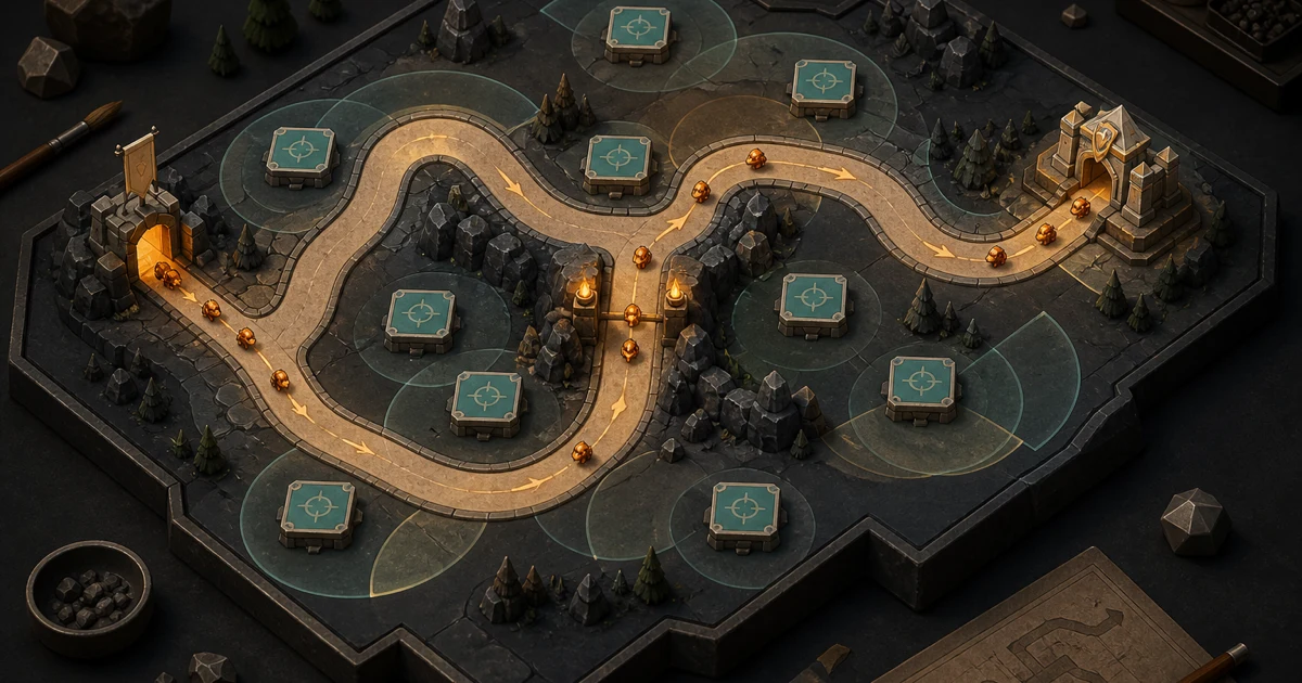
A readable tower defense map answers three different questions at three different times.
Before the wave: What is my plan?
During the wave: What matters right now?
After an enemy leaks through: Why did that happen?
If the map answers only the first question, it may look clear while empty and collapse into noise as soon as combat starts. If it answers only the second, the player can follow the action but cannot form a useful strategy. If it never answers the third, failure feels arbitrary instead of instructive.
Readability is not the same as simplicity. A map can have branching lanes, dense scenery, layered elevation, and several kinds of threats. The test is whether those details preserve the information a player needs in each moment.
Before the wave: make the plan visible
The quiet moment before a wave belongs to the route.
A player should be able to find the enemy entrance, follow the lane, notice meaningful splits, and locate the defended destination without mentally untangling the scenery. That does not require painting a bright stripe across the ground. It requires the route to have a consistent visual identity.
Edges, surface material, direction markers, elevation changes, and surrounding negative space can all help. The important part is that they agree. A path that looks broad but behaves like a narrow lane sends one message visually and another mechanically. A decorative bridge that resembles a playable route creates a false choice before the player has placed anything.
Give chokepoints a reason to look important
A chokepoint is not readable merely because it is narrow. The player also needs to see why that space could matter.
Useful visual cues might include:
- two lanes compressing into one;
- a bend that keeps enemies inside a potential firing area;
- an open pocket beside the lane that invites a cluster of defenses;
- a landmark that makes the location easy to recognize later.
The goal is not to label the “correct” answer. It is to expose the geometry that makes several answers worth considering. When every bend looks equally important, the player has to learn the map by wasting attempts rather than by reading it.
Make build zones look usable
Buildable space is an affordance: the map is telling the player, “You can act here.” That message should not depend on color alone.
The W3C’s guidance on the use of color is written for web content, not game maps, but the underlying design lesson travels well: when information matters, reinforce color with another visible distinction. A build zone might also have a recognizable shape, border, texture, height, or icon. A blocked zone should differ by more than a red tint.
That redundancy helps the whole composition, not just an isolated marker. It lets the palette carry atmosphere while shape and structure carry rules.
Establish a hierarchy before adding decoration
On an empty map, the visual order usually needs to be something like:
- the enemy route and defended destination;
- places where the player can act;
- hazards, gates, or other rule-changing features;
- landmarks that help with orientation;
- decorative detail.
This is not a fixed recipe. It is a test of priority. If a sparkling waterfall pulls more attention than the lane entrance, the map is spending its strongest signal on background flavor. The waterfall can stay, but it should know its job.
During the wave: protect the decision layer
Combat changes the map. Enemies overlap, towers animate, projectiles cross, impact effects bloom, numbers appear, and interface elements compete for the same patch of attention.
The lane that was obvious ten seconds ago can disappear under the battle it is meant to support.
Riot Games describes game clarity as the ability to understand what is happening and respond to it. Its discussion of clarity in League of Legends emphasizes visual hierarchy and minimal noise: the amount of attention an effect demands should reflect its gameplay importance. The exact implementation will differ in a tower defense game, but the principle is useful. Not every attack deserves the same visual volume.
Let impact control emphasis
A routine attack can be quick and restrained. A hit that changes the immediate decision—stunning a group, opening a route, disabling a tower, or threatening the objective—needs a stronger read.
If every projectile is enormous, nothing is enormous. If every impact flashes at the same brightness, the player cannot tell which event deserves attention. The map becomes a stage covered by its own lighting rig.
Riot’s VFX style guide frames effects around gameplay space, power, and function while warning against visual clutter. For tower defense, that suggests a practical rule: an effect should clarify the event before it decorates it.
Ask of each effect:
- Can the player tell where it happened?
- Does its size match its importance?
- Does its shape suggest a line, area, burst, or persistent zone?
- Does it disappear soon enough for the lane to become readable again?
The last question matters. A clear effect can still create clutter if it lingers through the next decision.
Telegraph threats before they merge into the crowd
Once enemies bunch together, small differences become hard to parse. Important threats need an earlier read.
A distinct silhouette, movement rhythm, spawn cue, scale, or icon can introduce an enemy before it reaches the busiest part of the map. Color may reinforce that identity, but it should not have to carry the full burden. The player should not need to distinguish two similar dots in a swarm to know that one of them changes the plan.
The lane also needs to remain traceable underneath the group. At an intersection, enemy facing and motion should make the chosen direction clear. At a turn, effects should not erase the edge that shows where the route continues. At the destination, the final approach should stay visible enough for the player to judge how close a threat is to getting through.
Keep build information available without making it dominant
During combat, the player may still need to place or inspect a tower. Build zones cannot vanish completely, but they also should not compete with every active threat.
This is where state helps. A quiet base treatment can keep buildable areas recognizable. Selection, hover, or build mode can raise their emphasis when the player asks for it. The map does not need to shout every possible action at all times. It needs to reveal the right actions on demand.
After a leak: make failure explain itself
A leak is an enemy reaching the defended destination. The event is obvious. The cause often is not.
Did the defense run out of damage? Did a fast enemy escape the main firing window? Did a branch bypass the strongest towers? Did one effect hide a threat until it was too late? Did the player misunderstand a build zone or route?
A readable map leaves evidence.
The player should be able to trace the failed enemy’s route, connect it to the defenses that did or did not affect it, and identify a plausible next adjustment. That does not mean revealing a perfect solution. It means preserving cause and effect.
Several small choices contribute:
- Keep the route visible when an enemy reaches the destination.
- Give the leak a clear origin and endpoint instead of only changing a counter.
- Make tower ranges or targeting information inspectable when relevant.
- Distinguish a missed target from an attack that landed but was insufficient.
- Let landmark names, shapes, or positions support a useful mental note: “the left bend failed,” not “something happened in the upper clutter.”
When the player cannot explain the loss, the next move is a guess. When the failure leaves a readable trail, the next move becomes a hypothesis. That is the difference between repeating a level and learning it.
A three-moment map review
You can review a tower defense map without reducing it to a beauty shot. Look at it in the three states the player actually experiences.
1. Before the wave
Hide explanatory text you do not expect the player to read every time. Then ask:
- Can you trace every route from entrance to destination?
- Can you distinguish usable build space from scenery?
- Do branches, intersections, and chokepoints read before trial and error?
- Does the most eye-catching detail deserve that attention?
2. During the busiest wave
Capture the map when enemies and effects overlap. Then ask:
- Can you still find the route and the leading threat?
- Do high-impact events stand above routine attacks?
- Can you recognize important enemy types by more than color?
- Does any lingering effect hide the next decision?
3. Immediately after a leak
Pause on the result. Then ask:
- Can you reconstruct the failed enemy’s path?
- Can you tell whether the problem was coverage, timing, targeting, or damage?
- Is there enough information to propose a different placement or priority?
- Did the map communicate the failure, or did only the interface report it?
These three views expose different weaknesses. A beautiful planning screen can still fail under load. A legible battle can still leave no lesson behind. A map is readable only when its visual language survives the whole loop.
The map is part of the feedback system
Tower defense maps are not passive containers for towers and enemies. They teach routes, frame options, stage threats, and preserve the evidence a player uses to improve.
That makes readability a design system, not a polish pass. The lane geometry, build-zone language, enemy silhouettes, effects, landmarks, and interface states all need to tell the same story at the right volume.
Our earlier article on what makes tower defense fun looks at the genre’s broader decision-and-feedback loop. Map readability is one piece of that loop: it makes the plan visible, protects it during the action, and gives failure something useful to say.
Tinyfort TD is Fireproof Studio’s tower-defense game. Explore Tinyfort TD.